Sunday, 8 May 2011
Final pieces- front cover

Final Pieces - Contents page

The contents page follows the colour scheme of green black and pink that was featured on the front page of my magazine. I used the shape tool to outline the green box's along the top and down the left hand side of the page. I then placed the text over the top and inserted the other images using the the shape tool to provide a background for them. I lowered the opacity on the green box underneath the writing on the main image so that you could still see the entire image. I divided my content into 'regulars' and 'features' this allowes the reader to easily locate any piece they might be particularly interested in, i also put the cover pieces in a different colour in the 'features' section.
The images at the bottom are popular artist that 'Louder' has arranged interviews with i gave these stories photos because i felt they would catch some readers attention and people might buy the magazine to read the interviews.
This follows a conventional magazine contents page layout. I used the 'L' at the top of the page so that the 'L' becomes the logo of louder magazine.
Final pieces - Double Page spread

The layout of the double page spread is very conventional and is a style that is used in a varied range of magazines and one which my particular target audeince can relate to.
Photo's


Design Sketches -front pages double page spreads and contents page
 This is my first design for the loyout of my contents page it follows a conventional style and would be easy to use. I like this layout because it doesnt look too busy and is easy to understand. The reader can see images for key stories and there is also a letter from the editor.
 my second design has a main image in the centre of the page with smaller polaroid images at the bottom. it uses the 'L' from louder at the top left of the page and has the content of the magazine running along the side of the magazine this is similar to the design of the NME magazine that I analyised and is where i got the inspiration from.
 This is a design for my double page spread. instead of havin one main image on the side of the page like most magazines would i have used two images one on either side of the page. these images would be surrounded by text and would be cut out onto the background of the page.
This double page spread follows a much more conventional layout with the mai image on the left and the text on the right. i like this layout because it is simple and poeple would be attracted to it because it is how they are used to seeing thier magazines designed.

I like the layout of my third double page spread because it is different from what you are used to. It uses a series of polaroid images across the top of the page with the article written underneath it. The images across the top of the page would be a series of images that tell the story.
 This is the first design for my front cover, it uses an extreme close up and the face takes up almsost the entire page this will draw an audience in immediatley especially if i used an attractive model. i have a banner along the bottom and a pug on the top Left. the barcode would be position at the bottom right of the page as with most magazines.
 This second Design is slightyl different from most magazines as the image is the back ground of the entire magazine. other than that it uses conventional magazine layout.
 My third and final front page desgin is extrmeley conventional with a medium close up used although it simple and conventional it is also a little boring.
 My third design for my contents page uses a number of polaroid shots that cover almost the entite page. although this may make the magazine look 'exciting' it would also make it more complicated to find sotries and may look too busy and put poeple off of buying it because it is not laid out simply enough.
Initial Ideas
A simple break down of the initial ideas for my magazine
Title- for my title I came up with a few names ;
- Louder
- Squeeze
- Music Mayhem
- Music Music Music
Main Story lines;
- A new pop star – this would involve an interview with someone new on the scene of chart music.
- Youngest band in the charts- I could call the ‘the new kids on the block’ they would be a young hit band and it would be an interview with them about how music changed their lives
- An artist with a new number one record/album- an interview describing how their life has changed since their last song/album
- Band split- a tribute to the old band and reasons for their split
- Rival bands fight for the number one spot- a profile on each of the bands with a brief interview.
Colour Schemes;
· Red/white/blue – works well together has been used in other magazines.
· Red/black – this also works well but may not be right for my genre of music.
· Pink/green/black – these colours go well together and would attract the right sort or audience for my magazine.
· Purple/black – I like these two colours together and they would also fit in well with my music genre.
Target Audience

This is Sarah; she is seventeen years old lives in the outskirts of London
Based on the NRS system my target audience for my magazine will be level D and E as it is mainly aimed at teenagers and young adults who are either currently studying at school or university and D and E are where students fit into. Because Sarah is still a student and spends most of the money she earns at her weekend job on new clothes and nights out with her friends I wouldn’t be able to price my magazine to high, so I think that £1.60-£2.20 is an expectable price for a weekly magazine so I would probably price it at around £1.90. However if I was to sell the magazine fortnightly or monthly the price would rise to around £2.00-£3.00.


Preliminary task final pieces

This is the front page of my school magazine that i had to construct as part of my preliminary task. I used a picture of some students at my school and cut them out using the magnetic lasoo on photoshop i then placed them on a plain blue backgroun, the school colours, and placed a main cover line over the top. The mast head is at the top right of the page and followed by my school bage, highlighting that it is a school magazine.

the contents page also uses a blue background to fit in with the school colours theme. here i have a list of the features in te magazine and a photo of two sixth form students recieving thier results this is a story that i would cover in my magazine. The white writing on the blue is easy to read and fits is the same colour as the text on the front page.
Monday, 2 May 2011
Three contents pages
 The first contents page i designed uses a basic layout but with scattered images in the bottom right hand corner to make it look more interesting. It seperates the regulars from the main front cover stories making it easier for the reader to find anything they may be particularly interested in. It also features a editors lettor in the top left hand corner this is a common layout for some genres of magazine such as a gossip magazine.
The second design has a different type of layout and that is not so generic it would have images all down the right hand side and along the bottom and the magazine features in the middle also seperating different features by thier genre 'hot gossip' and 'regulars' so that it is easier for the reader to allocate what they want to read.

My third design for the contents page uses the top half of the page for the editiors letter. Although this may look neater on a page it restricts the amount that can be written on the bottom of the page and may make the magazine look tacky as all of the actual content would look squashed or minimal. As well as this i would also have pictures along the bottom but they may look too small and it wouldn't really be worth having them.
Monday, 4 April 2011
Three front pages

The title I have used for design 1 is "Go Goffs".
This is design is extremely plain and simple. The front page main image is a medium long shot of a Goffs student and takes up almost the entire front page with just the name of the magazine along the left hand side. The font is a bold bubble writing and it would have a shadow effect.
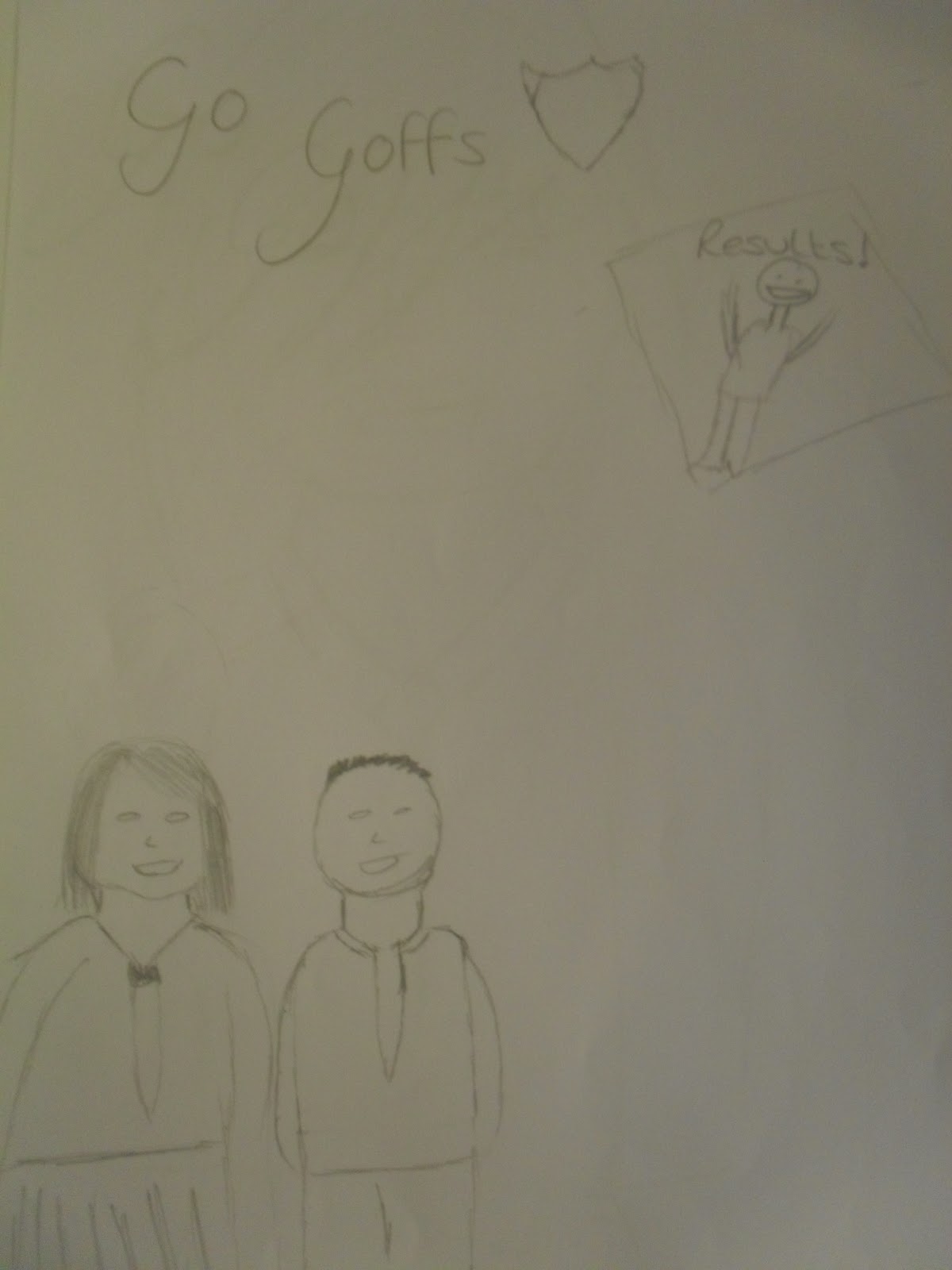
The second design used an italic font with the Goffs school logo next to it. i used a medium long shot of two young pupils showing the new uniform and my main story would be about the new Goffs school uniform. This design also using a very basic and conventional layout. i also have an image of a pupil celebrating their results as another feature of the magazine.

My third design for the front page uses a medium shot of a female pupil at the school in her uniform showing the new girls uniform. A bold italic font would be used and although in the design the font covers the models eyes i would have to change this because the eyes are a key part in any image.
Subscribe to:
Comments (Atom)