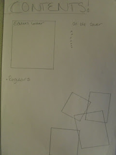
 The first contents page i designed uses a basic layout but with scattered images in the bottom right hand corner to make it look more interesting. It seperates the regulars from the main front cover stories making it easier for the reader to find anything they may be particularly interested in. It also features a editors lettor in the top left hand corner this is a common layout for some genres of magazine such as a gossip magazine.
The second design has a different type of layout and that is not so generic it would have images all down the right hand side and along the bottom and the magazine features in the middle also seperating different features by thier genre 'hot gossip' and 'regulars' so that it is easier for the reader to allocate what they want to read.
My third design for the contents page uses the top half of the page for the editiors letter. Although this may look neater on a page it restricts the amount that can be written on the bottom of the page and may make the magazine look tacky as all of the actual content would look squashed or minimal. As well as this i would also have pictures along the bottom but they may look too small and it wouldn't really be worth having them.


No comments:
Post a Comment